Case study: Burgerry
A burger restaurant website built around a memorable brand voice, clear menu presentation, and a simple path to booking.
Project overview
Burgerry is a burger restaurant website built to do two things well: make people hungry and make them act. The site centers the brand around a simple promise, strong food imagery, and a clear path to table booking.
The tone is direct and friendly. Instead of overexplaining, the website lets the brand voice, menu, and calls to action do the work. That makes the experience fast to understand and easy to remember.
Brand positioning
Burgerry uses a playful but focused identity. The name itself is memorable, and the line "Assapora la Felicità" creates a feeling that is both emotional and appetizing.
For a restaurant site, this matters. Visitors should immediately understand what kind of place this is, what mood it creates, and why they should book a table instead of bouncing to a competitor.
Site architecture
The structure is intentionally lean.
- Home - introduces the brand, the promise, and the core menu
- Menu - makes the food easy to scan by category
- News / Blog - keeps the site active and supports SEO
- Reservation flow - pushes users toward booking with minimal friction
This is the right kind of simplicity for a restaurant website: enough structure to guide, not so much that it gets in the way.
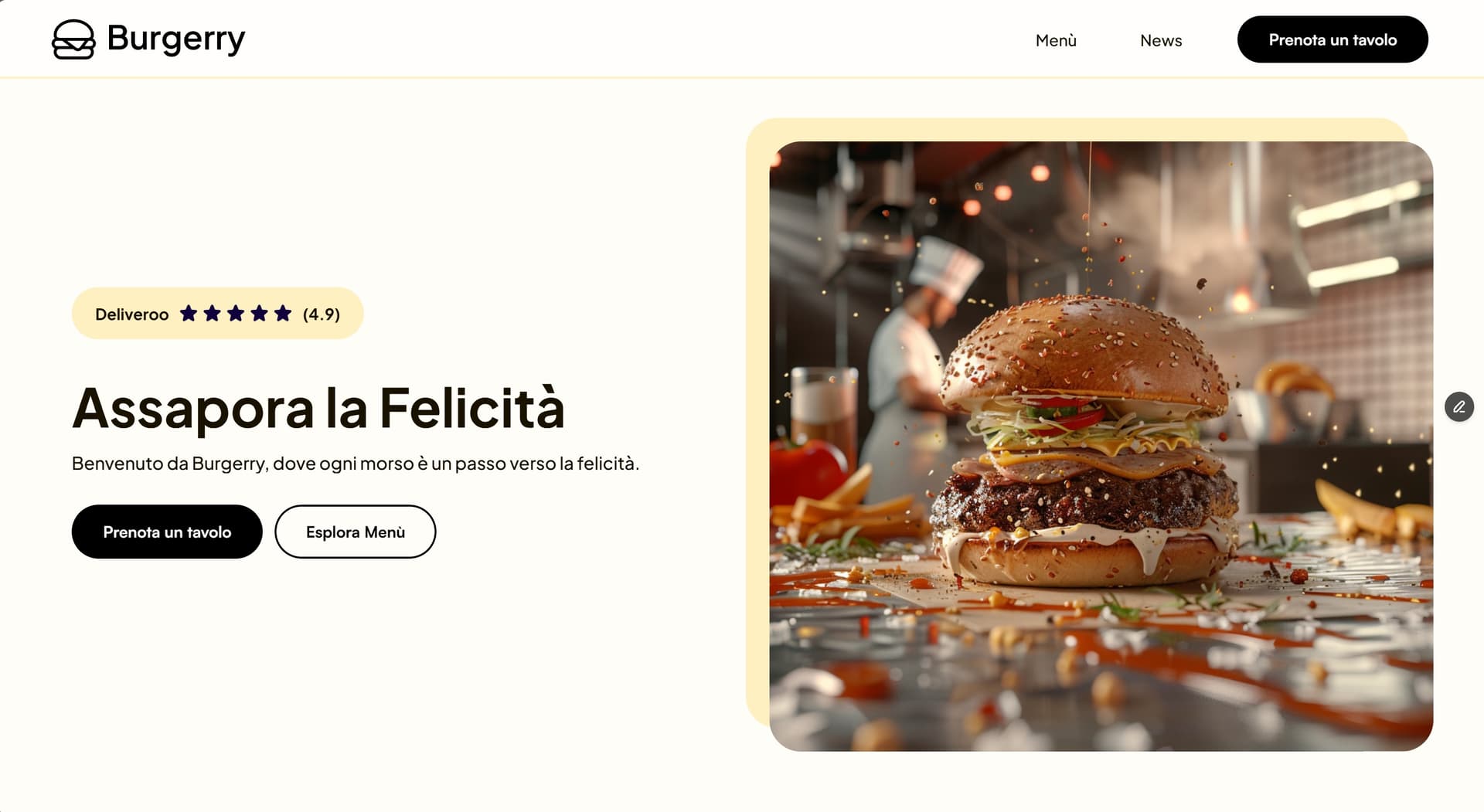
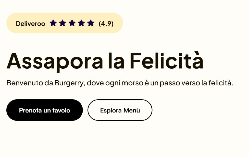
Hero and first impression
The hero section does the heavy lifting. It needs to communicate taste, personality, and action in a few seconds. Burgerry does this by combining a strong headline, a visible CTA, and food-forward visuals.
The first impression is not generic hospitality design. It feels specific to the brand and specific to burgers, which is exactly what gives the page its identity.
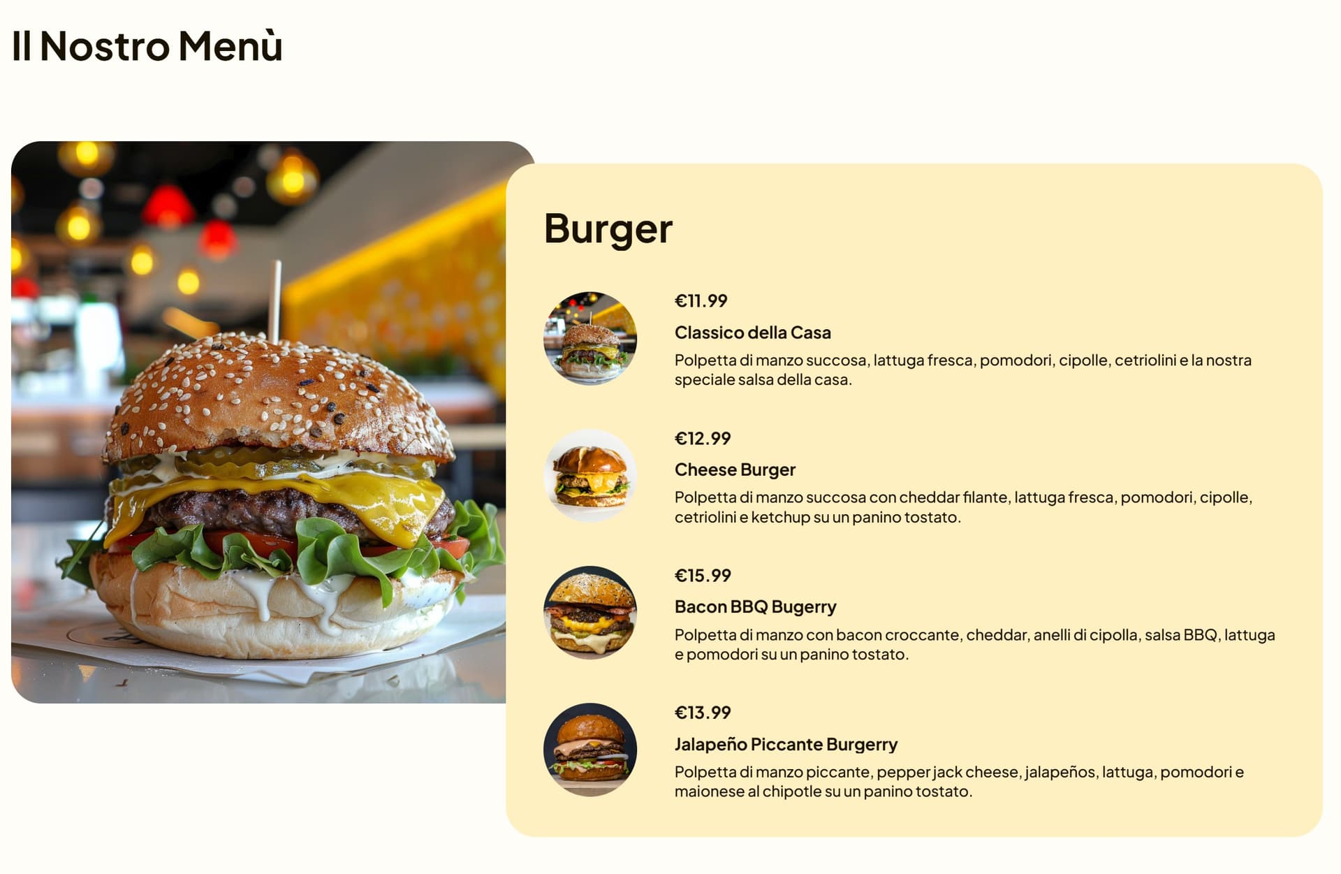
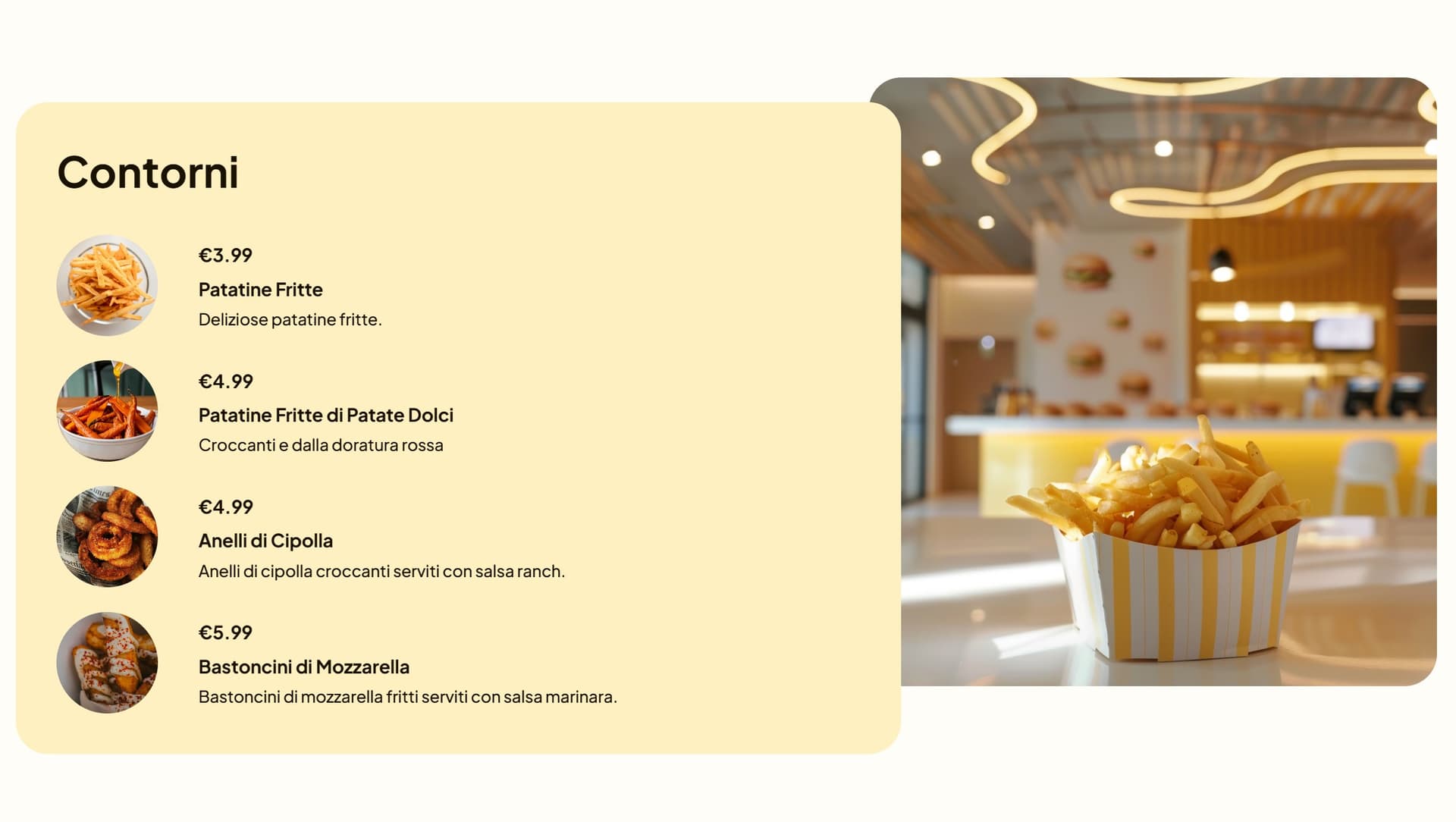
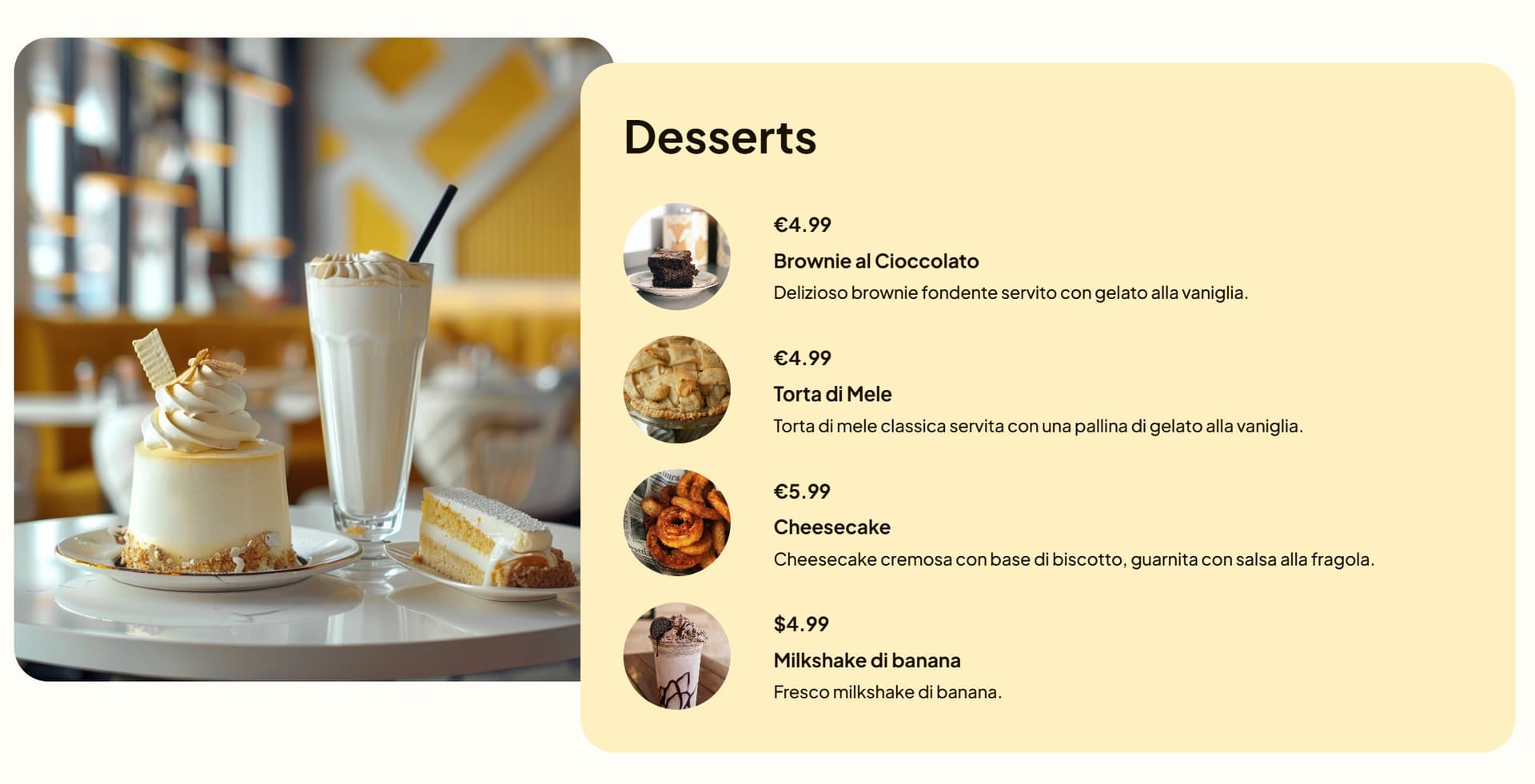
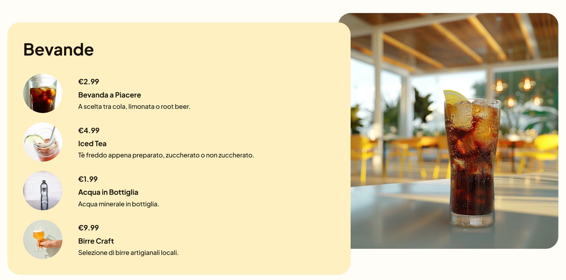
Menu presentation
The menu section is the practical core of the site. Burgerry organizes the offer into clear categories so users can find what they want quickly: burgers, sides, desserts, and drinks.
That structure reduces friction. People do not need to dig through a long wall of text, and the site can still show enough choice to feel complete.
Why this works
- The categories are familiar and easy to scan
- Pricing is visible, which helps decision-making
- Descriptions stay short and appetizing
- The layout feels quick, not crowded
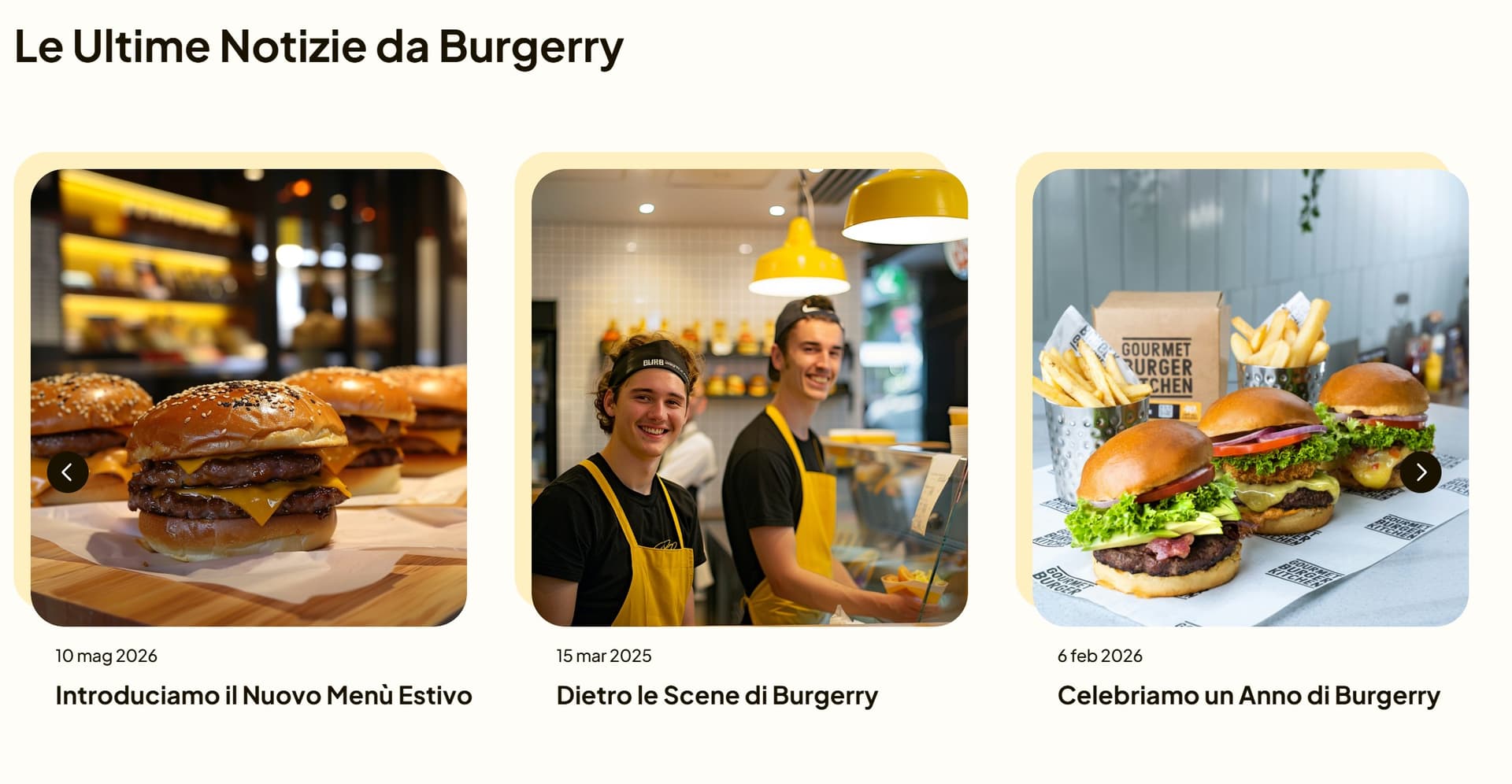
News and blog section
The site also includes a news area that keeps the brand alive beyond the menu. This is useful for promotions, seasonal changes, and content that supports organic visibility.
For a restaurant brand, the blog does not need to be heavy or editorial. It just needs to feel active, relevant, and useful enough to give users another reason to stay on the site.
Reservation and contact path
The final goal of the site is conversion: table bookings. That means the reservation path has to stay clear all the way through the page.
Burgerry keeps the path short with repeated booking prompts, a visible contact area, and a final section that invites the user to visit the restaurant directly.
Trust and conversion drivers
- Repeated booking CTAs placed at the right moments
- A strong brand voice that makes the site memorable
- Clear menu categories that reduce uncertainty
- A news section that suggests the brand is active
- A simple contact route that lowers booking friction
Together, these elements create a site that feels polished without becoming complicated.
Conclusion
Burgerry is a good example of a restaurant website that knows what it is supposed to do. It builds appetite, presents the menu clearly, and keeps booking within easy reach.
The result is a brand experience that is direct, recognizable, and conversion-oriented, which is exactly what a modern hamburger restaurant site needs.
Burgerry website: Burgerry